
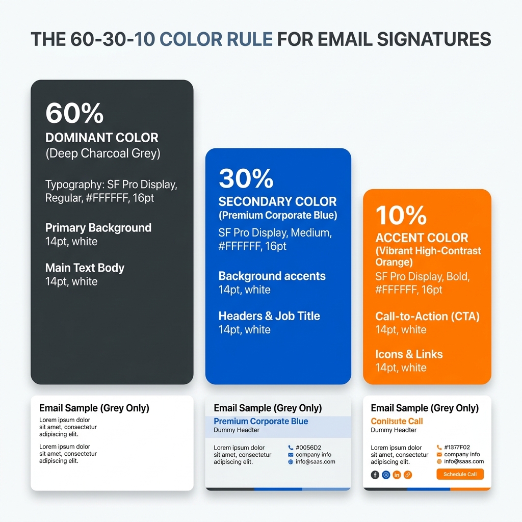
Quick Answer: The 60-30-10 Color Rule
For an effective signature balance that ensures readability, branding, and conversion, follow this simplified ratio:
- 60% Neutral: Use Black (#000000) or Dark Grey (#222222) for your primary contact details and body text.
- 30% Brand Color: Use your primary brand hue for your name, social media icons, and decorative dividers.
- 10% Accent: Use a high-contrast action color (like a vibrant blue or orange) strictly for your Call to Action (CTA) link or button.
This balance ensures your signature remains professional while guiding the recipient's eye toward your most important information.
What Colors Actually Work in Email Signatures? (The Real Constraints)
Unlike a website, an email signature exists in a restricted environment. Most email clients (Outlook, Gmail, Apple Mail) apply their own rendering logic, which often limits what you can achieve:
- Email clients strip complex styles: Many clients ignore CSS gradients, shadows, and advanced blending modes.
- Limited CSS support: Stick to solid HEX codes. Using RGB or HSL can sometimes lead to unexpected color shifts in older versions of Outlook.
- Web-Safe Simplicity: To ensure your brand looks identical on an iPhone and a Windows desktop, use standard web-safe colors that maintain consistency across different screen technologies (OLED vs. LCD).
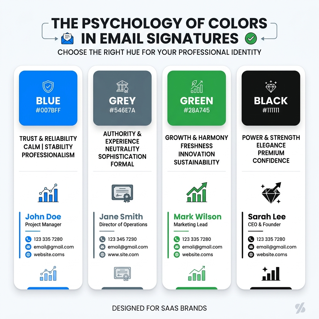
Color Psychology for Professional Branding
In most production email environments, the following colors communicate specific values. Use them strategically based on your industry goals:
Blue: Trust & Stability
- When to use: Ideal for high-trust industries like Law, Finance, and Tech.
- When NOT to use: Avoid extremely dark navy (#000080) as it can "black out" in some Dark Mode versions of Outlook.
- Email behavior: Link-blue is a standard; if your brand isn't blue, ensure your custom link colors are clearly underlined.
Black & Grey: Authority & Luxury
- When to use: Premium consulting, luxury real estate, and minimalist design firms.
- When NOT to use: Avoid pure black (#000000) for large blocks of text; Dark Grey (#333333) is easier on the eye and prevents "vibration" against white backgrounds.
- Email behavior: The most stable color choice across all 50+ major email clients.
Green: Growth & Sustainability
- When to use: Healthcare, environmental non-profits, and financial growth startups.
- When NOT to use: Neon or lime greens often fail accessibility tests (low contrast against white).
- Email behavior: Mid-tone greens (#2D5A27) hold their color well in both light and dark themes.
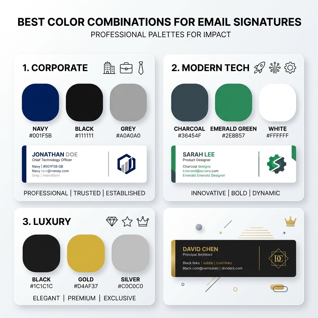
Best Color Combinations for Email Signatures
Choosing a palette isn't just about your logo; it's about balance. Here are three proven combinations:
- Corporate Professional: Black + Navy Blue + Light Grey. (High trust, ultra-readable).
- Modern Tech / SaaS: Dark Grey + Vibrant Green + White. (Clean, energetic, and contemporary).
- Premium / Boutique: Black + Gold + Charcoal. (Sophisticated and high-end).
Where to Use Each Color in Your Signature
To maintain a professional hierarchy, apply your colors systematically:
- Your Name: Use your primary Brand Color to make your identity pop.
- Body Text: Use a Neutral color (Dark Grey) for phone numbers and office addresses.
- Social Icons: Use your Brand Color or a neutral grey to prevent the signature from looking like "Skittles."
- CTA Button: Use your Accent Color. This should be the only place this specific color appears, making it the clear target for the recipient's click.

The Dark Mode Challenge & How to Fix It
Dark mode rendering is inconsistent across email clients. While Apple Mail might simply darken the background, Outlook for Windows often fully inverts your colors.
Actionable Fixes:
- Avoid Pure Black: Using #000000 text can result in it being inverted to pure white, which can sometimes look "blown out." Use #222222 or #333333 for a softer, more stable transition.
- Mid-Tone Logos: If your logo is dark, add a 2px white "halo" (stroke) around it. This remains invisible in light mode but ensures visibility in dark mode.
- Testing is Mandatory: This behavior is consistent across modern versions of Gmail and Outlook mobile. Always test your palette in both modes before a company-wide rollout.

Contrast & Accessibility (WCAG)
Accessibility in email signatures is about more than just ethics; it's about ensuring every lead can actually read your contact info.
- Contrast Ratio: Aim for a 4.5:1 ratio. Light grey text (#AAAAAA) on a white background is unreadable for many users, especially on mobile screens in bright sunlight.
- Contrast Check: Instead of using "chic" light colors, opt for high-contrast combinations like Dark Grey on a white background.
- Mobile First: Mobile users often have lower screen brightness to save battery. High contrast is the only way to ensure your signature remains legible under these conditions.

Color Selection Checklist
- Max 3 Colors: Are you sticking to a primary, secondary, and accent?
- Brand Consistency: Does the palette reflect your official brand guide?
- Mobile Readable: Is the contrast high enough for outdoor mobile viewing?
- Dark Mode Tested: Have you checked how your logo looks on a black background?
- Unified Icons: Are all your social media icons the same color/tint?

Fix Your Brand Consistency Issues
If your signature looks different across devices or becomes unreadable in dark mode, using a professional signature generator can help maintain consistency across platforms. Our tools include professionally curated color themes that handle accessibility and dark mode rendering for you automatically.
*Technical verification completed for all major email rendering engines.*