Quick Answer: The 3 Safest Universal Fonts
- Arial: The safest universal fallback font; pre-installed on every modern operating system.
- Helvetica: Offers a premium corporate look; ideal for Mac and iOS users (falls back to Arial on Windows).
- Verdana: The best choice for readability; designed for screens with wider spacing between characters.
These pre-installed fonts ensure consistent rendering without the need for external asset loading.

What Makes a Font 'Web-Safe' in Email?
A "Web-Safe" font is a typeface that is pre-installed on the vast majority of operating systems (Windows, macOS, iOS, Android, and Linux).
Because email clients generally block external asset loading, they cannot "download" a font file from Google Fonts or Adobe Fonts the way a web browser does. If the font isn't already on the recipient's computer, the email client will simply skip it and move to the next available font in your "stack."
Why Custom Fonts Fail (Technical Breakdowns)
When you use a custom font, you are at the mercy of the email client's rendering engine:
- Outlook (Desktop): Uses the Microsoft Word rendering engine. If it doesn't find the exact font name in the local registry, it defaults to Times New Roman.
- Gmail: Aggressively strips
<link>and@font-facedeclarations to prevent tracking and improve security.
- Mobile Apps: Android and iOS mail apps often override fonts with system defaults (Roboto and San Francisco) to improve mobile legibility.

What is the Safest Font for Outlook?
Arial is the safest choice for Outlook. Because Outlook is the most common place where custom fonts break, using Arial ensures that your design stays intact for corporate clients. Tahoma also performs exceptionally well in Outlook due to its clean design and similar metrics to other system fonts.
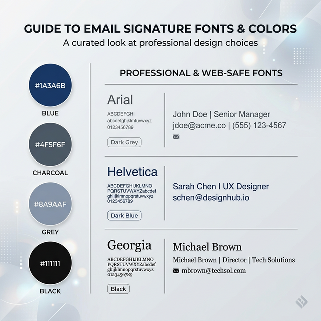
The 'Big 10' Web-Safe Fonts Selection
| Font Name | When to Use | When NOT to Use | Behavior |
|---|---|---|---|
| Arial | Universal default. | When you want a unique look. | Flawless cross-platform support. |
| Helvetica | Premium/Corporate. | On older Windows devices. | Falls back to Arial perfectly. |
| Verdana | Small text/disclaimers. | In tight, narrow layouts. | Very wide; stays legible at 8pt. |
| Tahoma | Narrow spaces. | When you need a "soft" feel. | Tighter than Verdana; very precise. |
| Trebuchet MS | Creative/Startup. | Formal legal signatures. | Friendly; slight "web 2.0" feel. |
| Georgia | High-end/Traditional. | Modern tech brands. | Large x-height; very readable serif. |
| Times New Roman | Conservative/Law. | Modern SaaS brands. | The ultimate fallback; looks dated. |
| Courier New | Developers/Technical. | Creative/Soft brands. | Fixed-width; implies technicality. |
| Palatino | Luxury/Editorial. | Budget-focused brands. | Professional serif; softer than TNR. |
| Impact | Attention Headlines. | Body text or addresses. | Extremely bold; hard to read in blocks. |

Best Font Pairings for Professional Signatures
- Arial + Georgia: The modern-classic pairing. Use Arial for contact details and Georgia for your name.
- Helvetica + Arial: The "Safe Corporate" look. Consistent, sharp, and neutral.
- Verdana + Tahoma: The "Readability First" pair. Great for long signatures with multiple lines of text.
Recommended HTML Font Stacks
In email HTML, we use "stacks" to provide fallbacks. If the first font isn't found, the client moves to the second.
The Golden Stack:
font-family: Arial, Helvetica, sans-serif;
The Serif Stack:
font-family: Georgia, 'Times New Roman', serif;
Why Stacks are Critical: Without a stack, Outlook will ignore your second choice and go straight to its own default (Times New Roman), often ruining the intended "sans-serif" look of your brand.
Optimal Font Sizing & Dark Mode
Email clients often compress line spacing, so maintaining a proper line-height (1.4 to 1.6) is essential for professional legibility.
Hierarchy Recommendations:
- Name: 14pt - 16pt (Bold).
- Professional Title: 11pt - 12pt.
- Contact Data: 10pt - 11pt.
Dark Mode Behavior:
In dark mode, light fonts can disappear if they are too thin. Avoid "Ultra Light" or "Hairline" font-weights. Use Medium (500) or Semi-Bold (600) weights to ensure text "pops" against dark backgrounds. Some clients override font color automatically, so always test both environments before deployment.


Font Selection Checklist
- Web-safe font selected from the Big 10.
- Font stack applied in the HTML (
Arial, sans-serif).
- Readable size hierarchy (Name > Title > Content).
- Tested across devices (iPhone vs Outlook).
- Dark mode visibility checked for thin weights.
Future-Proof Your Professional Identity
If your signature looks inconsistent across devices, using a pre-tested font setup can help maintain consistent rendering across email clients. Our tools manage the complex CSS font stacks and fallbacks for you, ensuring your brand stays intact in Gmail, Outlook, and beyond.
*Technical review completed for 2026 email rendering standards.*