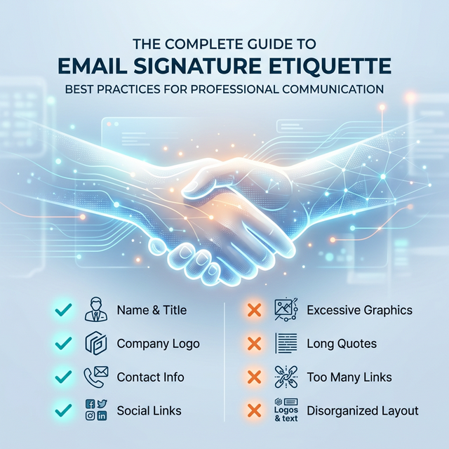
Quick Answer: The 'Golden Rule' of Signature Etiquette
The foundational rule of email signature etiquette is: Be helpful, not annoying. A signature is a utility, not a personal billboard.
- Goal: Provide necessary contact data and brand validation instantly.
- Clarity: Use a clear visual hierarchy so the recipient's eye knows where to go.
- Minimalism: If an element doesn't help the recipient reach you or trust you, remove it.
- Mobile First: Over 60% of emails are opened on mobile; your signature must fit a narrow screen.
- Themes: Your signature must look perfect in both Light and Dark mode.
What is Email Signature Etiquette?
Email signature etiquette is the set of unwritten (and sometimes written) rules that govern how a professional presents themselves at the end of an email. It is a subset of "Netiquette" that focuses on:
- Professional Standardisation: Aligning your digital identity with corporate values.
- Usability: Ensuring your contact information is accessible, clickable, and easy to read.
- Implicit Trust: Signaling that you are part of a stable, attentive organization.
Ignoring these standards doesn't just look messy; it can have technical consequences. A poorly structured signature can trigger spam filters or cause your email to be clipped in Gmail, hiding your most important message.
The 'Dos' of Professional Signatures
To maintain a high standard of professional etiquette, every signature should adhere to these core principles:
1. DO Keep it Brief (The 7-Line Rules)
Readability declines as signature length increases. The sweet spot for a professional footer is 4 to 7 lines of total content. This ensures you provide your Name, Role, Company, and primary Contact method without overwhelming the recipient.
- WHY it matters: Long signatures create "link noise" and make it harder for the recipient to find the one piece of data they actually need.
- Example: A 20-line signature including your life story, 8 social links, and a 10-paragraph legal disclaimer is an act of digital clutter that forces the recipient to work.
- Impact: Shorter signatures lead to higher click-through rates on your primary call-to-action.
2. DO Use Clear Visual Hierarchy
Your name should be the most prominent element, usually bolded and 1–2 pixels larger than the rest of the text. This allows the recipient to immediately attribute the "voice" of the email to a person.
- WHY it works: It mimics natural reading patterns, guiding the eye from the sender's identity to their authority (job title) and then to the contact options.
- Impact: Improves recognition in long, multi-person conversation threads.
3. DO Use High Contrast and System Fonts
Stick to professional, web-safe fonts like Arial, Calibri, or Verdana. Use dark charcoal or black text on light backgrounds to ensure 100% legibility across all platforms.
- WHY this is mandatory: Many mobile email clients strip custom fonts. If you rely on a "fancy" Google font without a backup, your signature will display in a generic font that can break your layout.
- Impact: Guarantees that your signature remains readable on everything from a legacy Outlook client to a modern iPhone.
The 'Don'ts' of Professional Signatures
Avoid these common mistakes that undermine your professional brand:
1. DON'T Use Image-Only Signatures
An image-only signature (one big JPG or PNG) is various etiquette failures rolled into one. It is completely inaccessible to screen readers, it's often blocked by high-security email servers, and it becomes a "Broken X" icon if the recipient has images disabled.
- The Consequence: If the recipient needs your phone number and they have images blocked, they see a blank box.
- Alternative: Use a proper HTML signature.
2. DON'T Repeat Your Email Address
The recipient already has your email address; they used it to receive the message! Including your email in your signature clutters the design without adding any new utility.
- Exception: Only include your email if you are sending a 'Plain Text' version where the 'Reply' behavior might be different inside a specific CRM.
- Impact: Removing the email address frees up vertical space for a mobile-responsive layout.
3. DON'T Use "Fun" or Script Fonts
Fonts like Comic Sans, Papyrus, or intricate script fonts undermine your credibility instantly. An email signature should reflect business stability, not personal artistic flair.
- The Alternative: Use system-safe fonts with bold and italic variations to create visual interest without sacrificing professionalism.
Good vs. Bad Signature: A Visual Comparison
Seeing the difference is more effective than reading about it. The "Bad" signature relies on excessive colors, massive icons, and a lack of alignment. The "Good" signature uses whitespace, branded colors, and a clear grid.
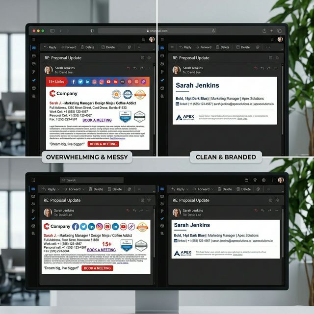
*Caption: Cluttered vs professional email signature layout. Notice how whitespace improves readability and builds trust.*
The Ideal Email Signature Structure
When building your footer, follow this structural template to ensure you meet all business email signature rules:
- The Lead: Your Name (Bold, 14pt-16pt).
- The Context: Professional Job Title (10pt-11pt).
- The Brand: Company Name & Linked Website.
- The Utility: Phone Number (formatted with country code).
- The Visuals: Company Logo or Professional Headshot.
- The Action: A single, clear call-to-action or social media icon.
- The Legal: Professional email disclaimer.
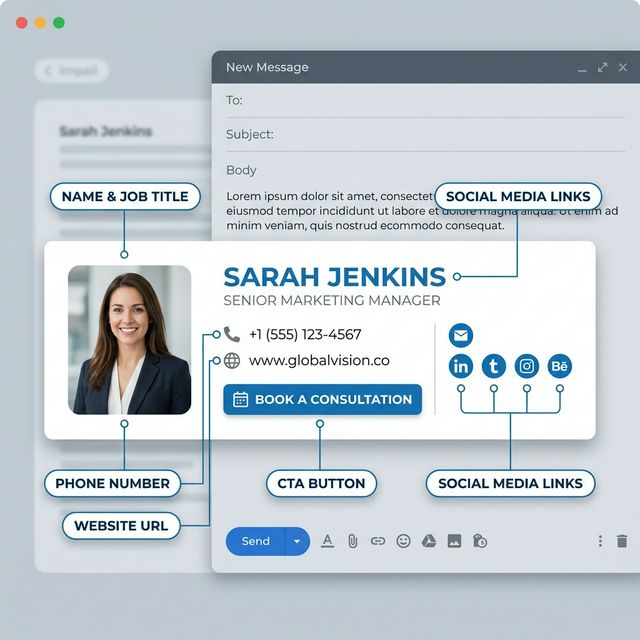
*Caption: The ideal structure of a professional email signature uses a vertical or two-column grid to maintain clarity.*
The Controversy of Inspirational Quotes
While a quote might be personally meaningful to you, it is a high-risk move in business etiquette.
- The Risk: Quotes are subjective. What you find "inspirational," a client might find "preachy," "cheesy," or even controversial. It forces your personal philosophy on a recipient who only wants to talk business.
- Corporate Context: Most enterprise-grade organizations strictly forbid personal quotes. It creates a brand inconsistency and can lead to HR issues if the quote is misaligned with company values.
- Bad Examples: "Believe you can and you're halfway there" or "Live, Laugh, Love." These belong on a coffee mug or Instagram, not in a professional procurement email.
- The Best Practice: Save the quotes for your personal social media. Keep your business footer focused on utility and marketing ROI.
Professional Etiquette Checklist
Before you hit 'Save' on your new signature, perform this final audit to ensure you follow all email signature best practices:
- Is the overall width under 450px? (Ensures it fits on every smartphone).
- Are there no more than 3-4 social media icons? (Prevents "icon clutter").
- Is the logo size optimized? (Prevents large file attachments).
- Are all links working and tracked? (Verifies the business channel).
- Is your disclaimer at the very bottom? (Standard legal placement).
- Have you removed 'Sent from my iPhone'? (Shows professional workstation use).
Mobile Etiquette: Responsiveness is Politeness
Over 60% of emails are now opened on mobile devices. A signature that looks great on a desktop monitor can be a "broken mess" on an iPhone.
- Wide Signatures: Signatures wider than 450px force mobile users to scroll horizontally, which is a massive UX violation.
- Small Tap Targets: Ensure your social media icons and phone numbers are large enough to be "tapped" by a thumb.
- Vertical Stacking: For mobile, it is better to stack elements vertically to fit the narrow viewport.
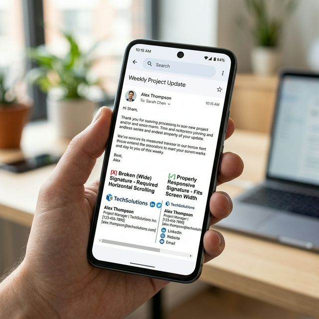
*Caption: Mobile responsiveness matters. A narrow, vertically stacked layout ensures every recipient sees your brand correctly.*
Dark Mode Compatibility
With most users now using Dark Mode, your signature must adapt to a black background.
- Transparent Logos: Never use a logo with a white background "box." It looks like an amateur mistake when viewed in Dark Mode.
- Color Contrast: Ensure your text colors are "midtone" or adapt correctly so they don't disappear on dark backgrounds.
- Visibility Test: Use a tool that allows you to see both modes before deploying to your entire team.
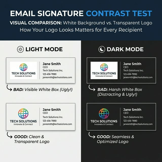
*Caption: Dark Mode visibility depends on transparent background assets and high-contrast text colors.*
FAQ: Signature Etiquette
What is the ideal email signature length?
Aim for 4 to 7 lines. This provides enough context without creating excessive vertical space in a thread.
Should I include social media links?
Only LinkedIn is mandatory for B2B. Others (X, Twitter, YouTube) should only be included if they are primary business channels.
Can I use banners in my signature?
Yes, but they must be professionally designed and rotated seasonally. Check our seasonal refresh guide for best timing.
How many links are too many?
We recommend 3 maximum. Every link competes for the recipient's attention. Keep them focused.
Take the Guesswork Out of Etiquette
Instead of guessing what looks professional, use InboxSign templates designed around modern email etiquette and compatibility standards. Our generator accounts for mobile scaling, dark mode, and corporate branding automatically.
Master your final impression. Build an etiquette-verified email signature using the InboxSign generator and command respect in every inbox.
Refer to our Gmail setup guide or Outlook tutorial to ensure your new, professional design is installed correctly.